brand Redesign Objective
To reimagine the brand identity of Burrito Boyz to a more modern, aesthetically pleasing design that captures the vibrant essence of the brand.
Process
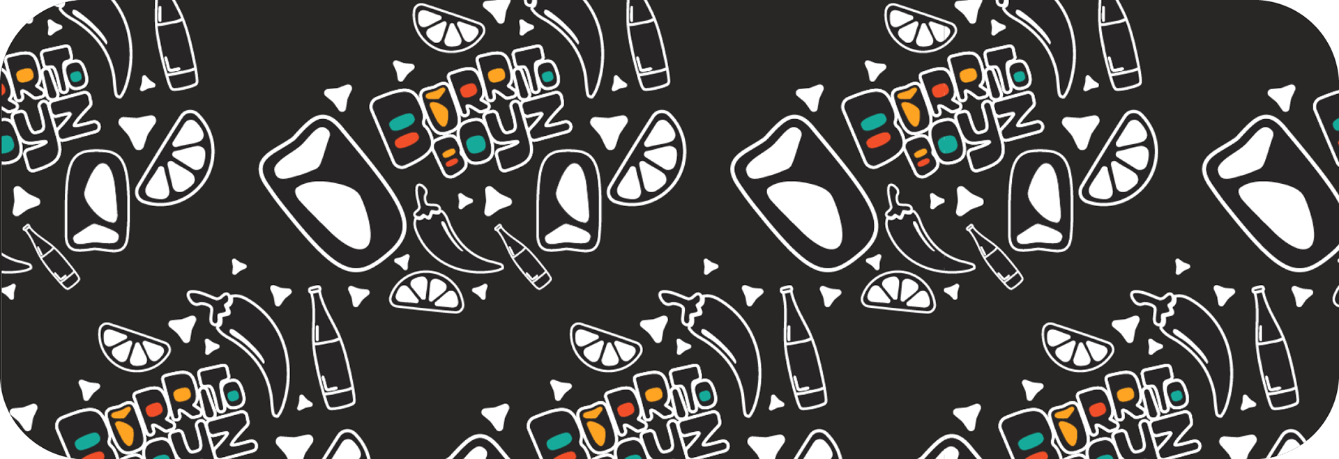
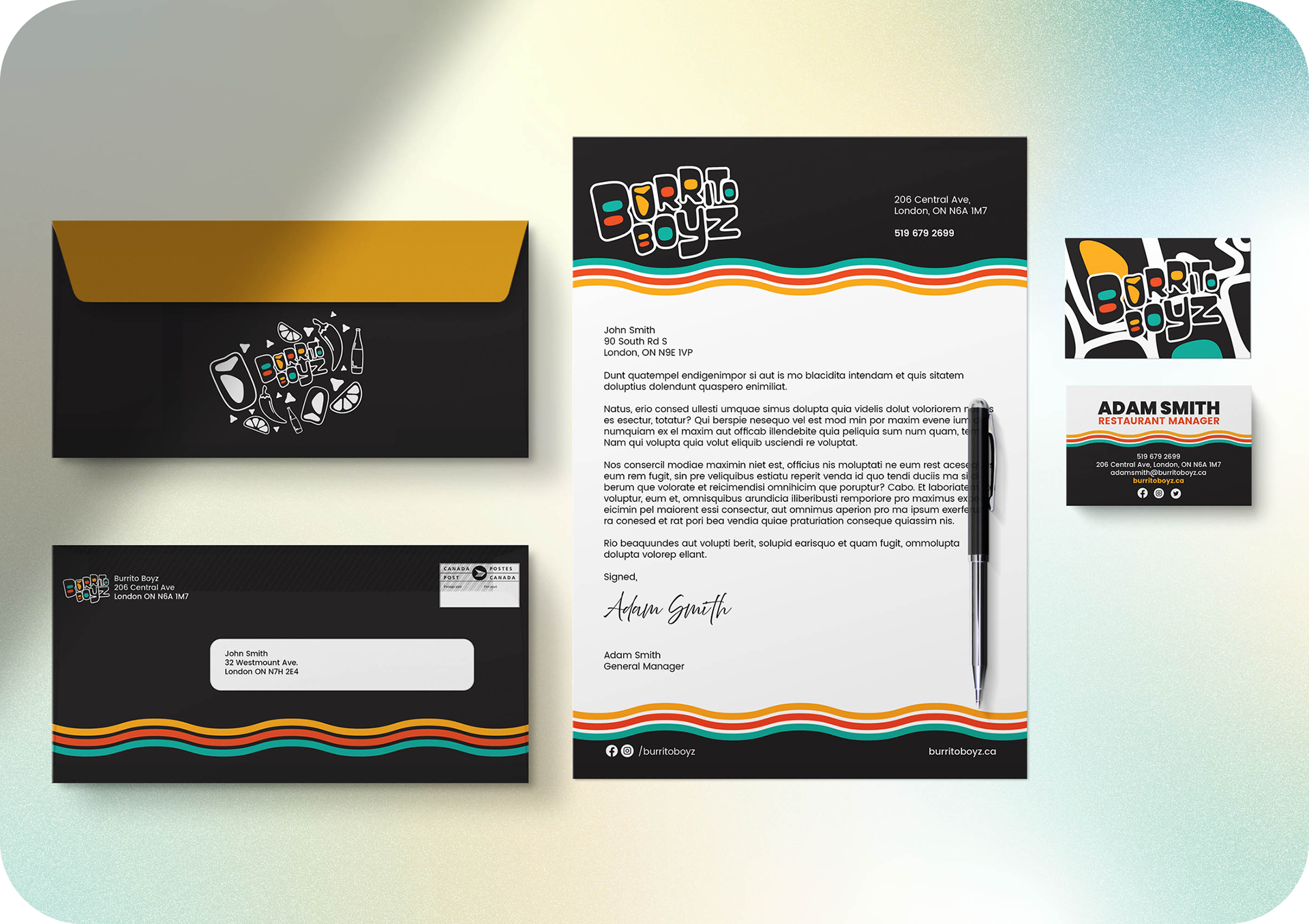
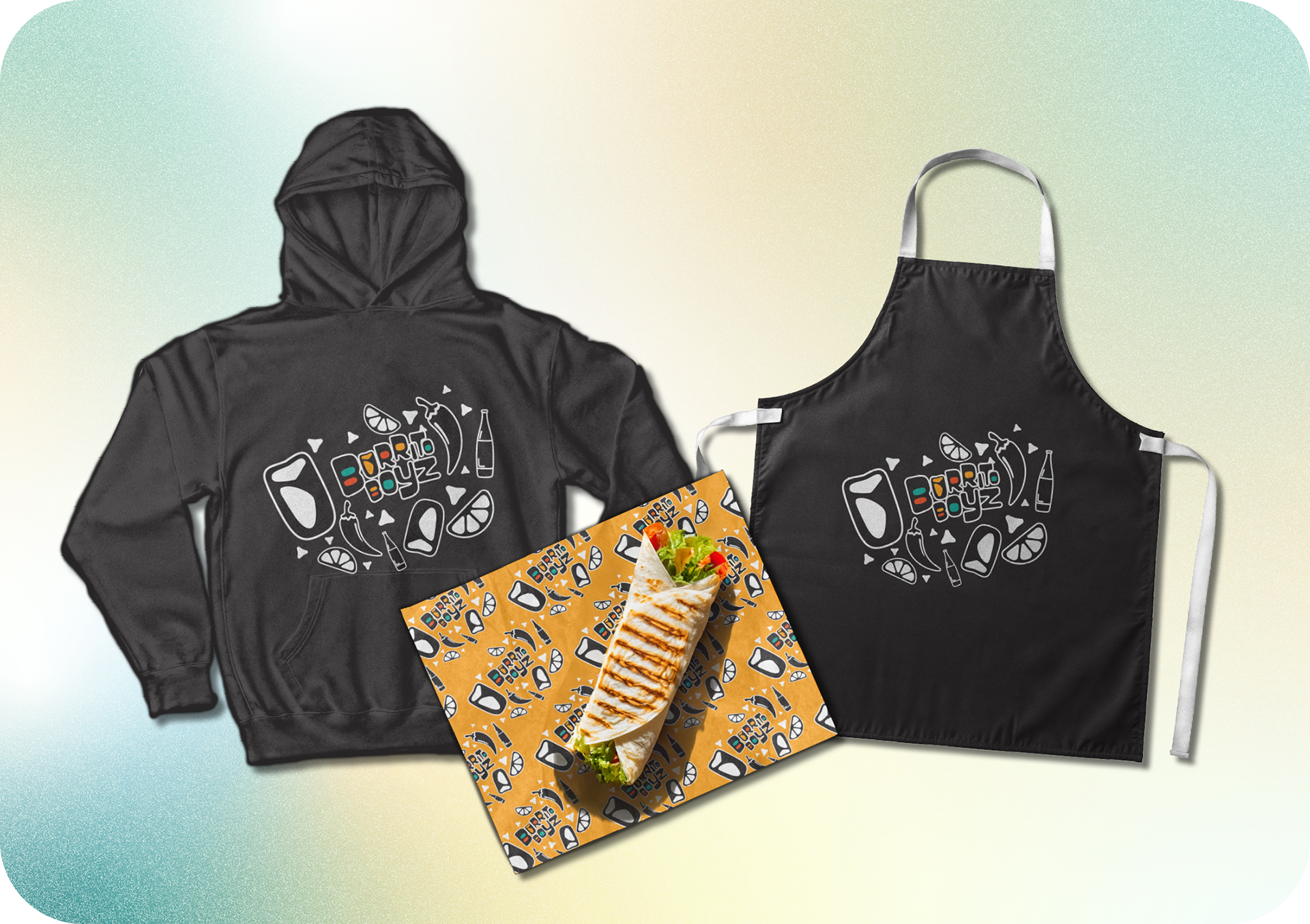
The process began by evaluating the existing Burrito Boyz identity to retain its bold personality while modernizing its look. Playful typography, simplified icons, and vibrant, ingredient-inspired colours were developed to create a cohesive, contemporary brand system.
The burrito-inspired “U” adds a clever touch of personality, while the dark and light background op, and memorable.tions ensure versatility. This modern refresh strengthens the brand’s identity as fun, fresh, and vibrant.


Icons

nachos icon

burrito icon
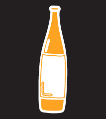
pop bottle icon

quesadilla icon
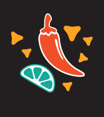
chili lime icon

taekout box icon
Stationary
Merch
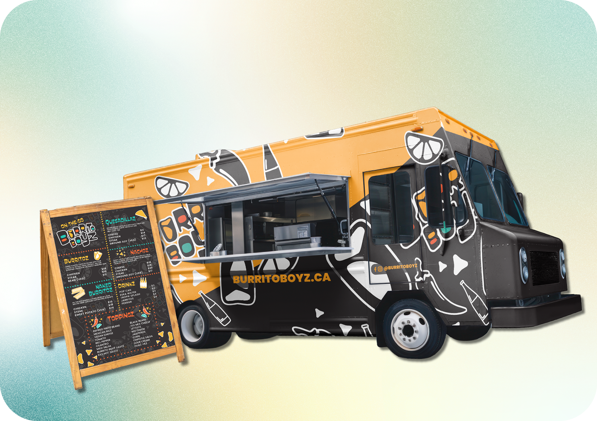
Food Truck Wrap & Menu Board